
Finding Classes Made Easy
Redesigning the class card for an evolving yoga brand
Project / Class Card System Redesign - Desktop, iOS, AppleTV
Client / Glo
Roll / Lead Product Designer
Year / 2020-2021

Insight
In 2020, propelled by the global pandemic, established online yoga and meditation brand, Glo, experienced a remarkable surge in its subscriber base. This surge, driven by a growing need for online wellness solutions, propelled Glo into the spotlight. However, even as the subscriber numbers soared, Glo faced a persistent challenge—ensuring a consistently premium user experience. This challenge led to an unfortunate rise in subscription cancellations and an influx of unfavorable app reviews.
Project
During an intensive 7-month collaboration, I worked closely with cross-functional teams encompassing product, engineering, and leadership to drive significant improvements in Glo's product experience. My direction was instrumental in redesigning key features, particularly the class card system, which had previously suffered from usability and design issues that fragmented the user experience across different devices. Furthermore, the successful redesign proved to be a critical milestone leading up to the launch of several core product features.
Results
15% Reduction in subscriber turnover
35% Increase in customer class starts
40% Decrease in time taken to find classes

Challenge
The absence of user testing at Glo over the previous four years had led to unverified assumptions about users class selection preferences, resulting in a product that didn’t fully meet the users needs.

Research and Validation
Developing a strong understanding of the user and studying industry leaders provided valuable insights for rapidly enhancing the card information hierarchy and style, enabling us to swiftly experiment with new UI/UX designs and collect essential user feedback within the project's initial weeks.
Key Learnings
Simplified directions for class information, featuring concise class titles that highlighted both the class length and focus, consistently led to better user performance in testing, with users processing the information nearly twice as quickly as with previous versions.

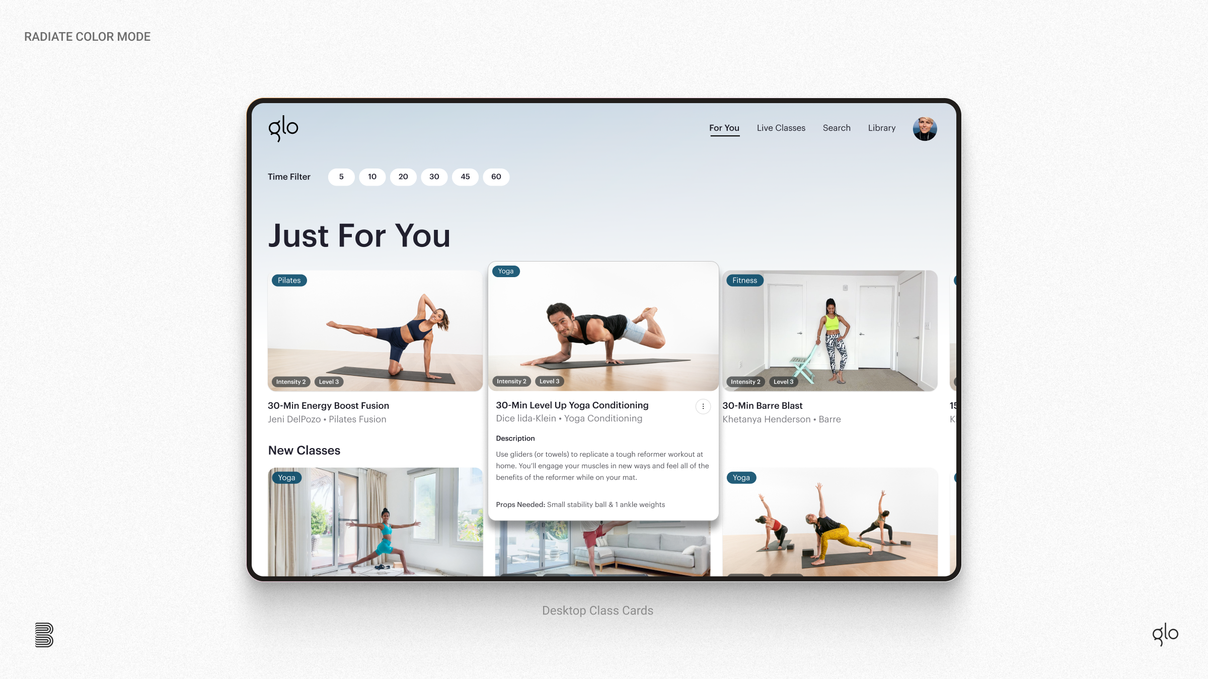
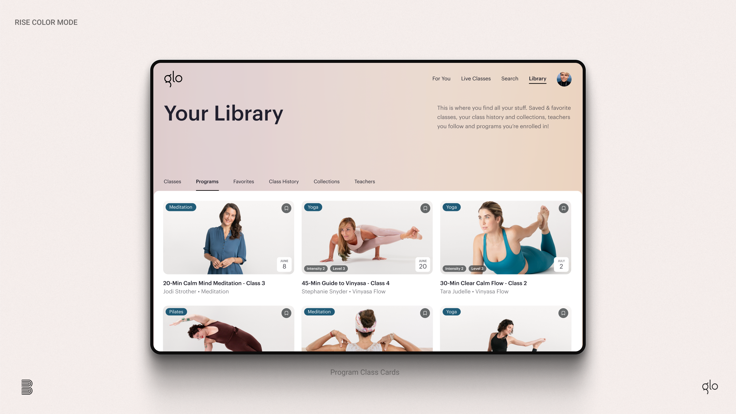
Unification
On desktop the class cards also featured a unique roll over that provided users with a brief view of the class description. Given the equal user base split between mobile and desktop, initial research indicated that addressing this issue was crucial for achieving a unified and seamless adoption of the class card system.
User Testing
To delve deeper into class descriptions, we dedicated our efforts to seamlessly integrating additional class information into the design, aiming to maintain a serene and elevated user experience. We examined various slideshow options, as well as enhanced modal cards featuring the full class description and a slideshow illustrating the various poses users could anticipate during the class.

Results
During user testing, we observed a consistent pattern: users actively utilized the full class description, as well as all additional information found on class landing pages prior to starting a new class. When we enhanced information accessibility during ABC tests and provided users with more information, users not only performed better but also indicated a consistent preference for more detailed content.

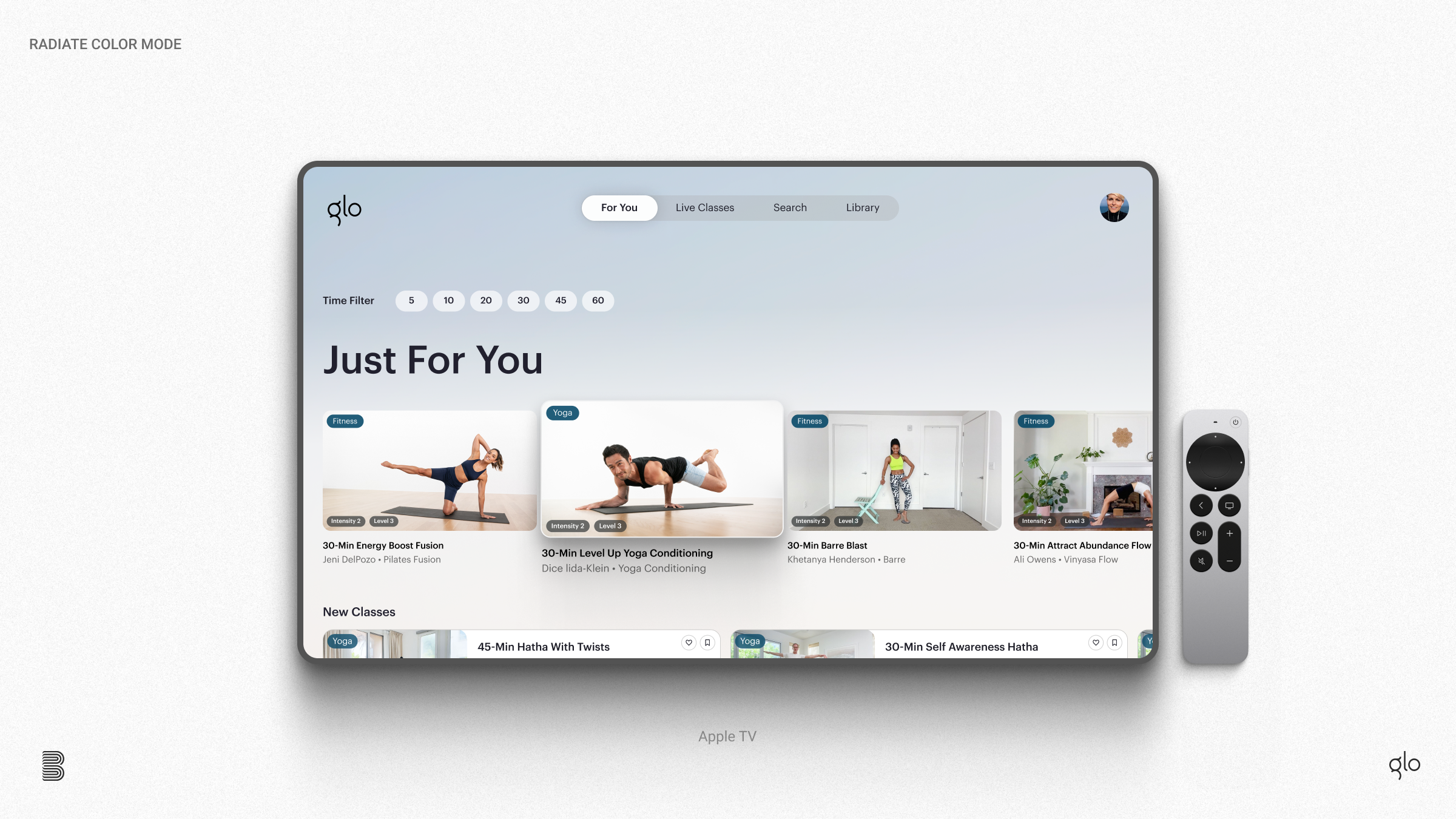
Class Card System
Mobile-first design principles prioritized ease of comprehension and swift adoption on any platform. Key features included streamlined animations, highly recognizable tags and labels, and refined typography weights and iconography to maximize accessibility. In addition, class image styles were updated to better support a wide variety of studio and remote location imagery.

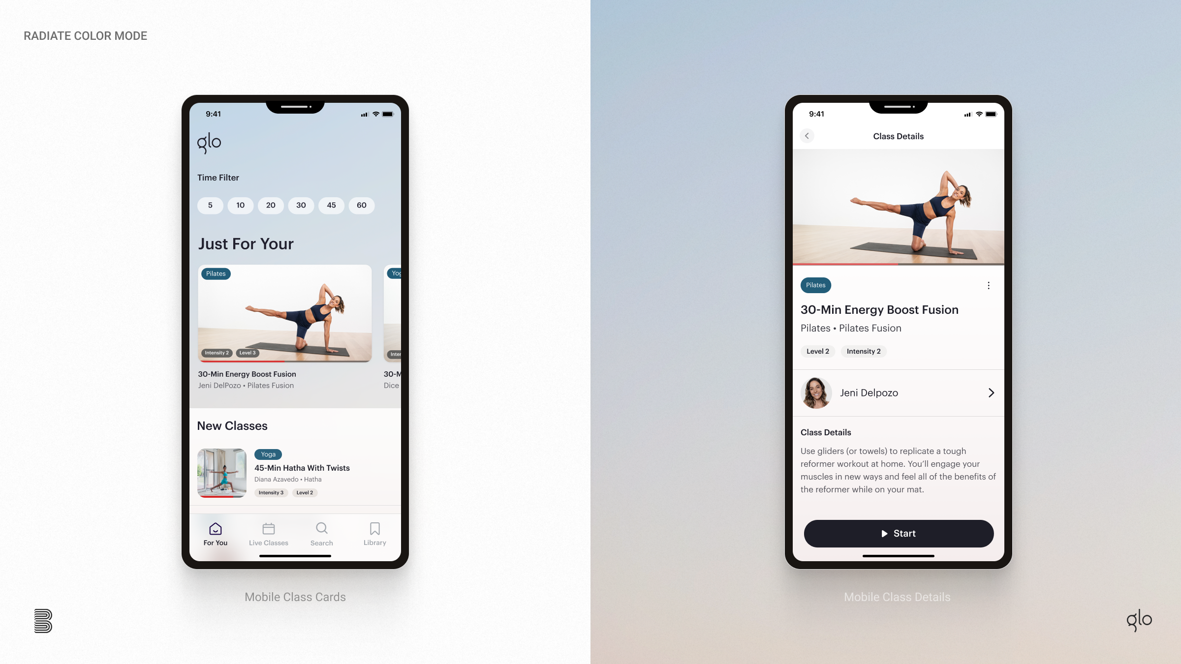
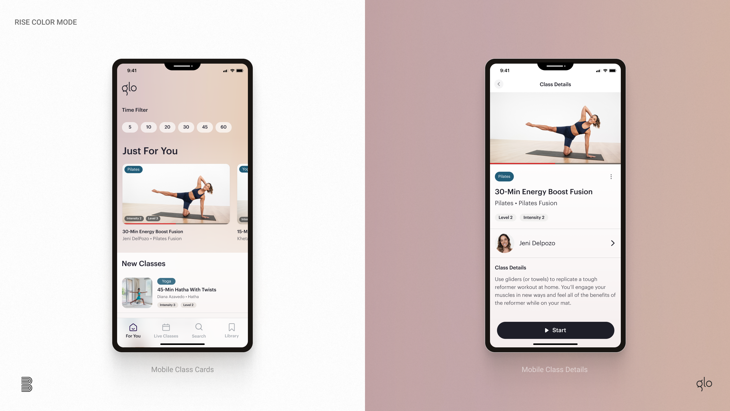
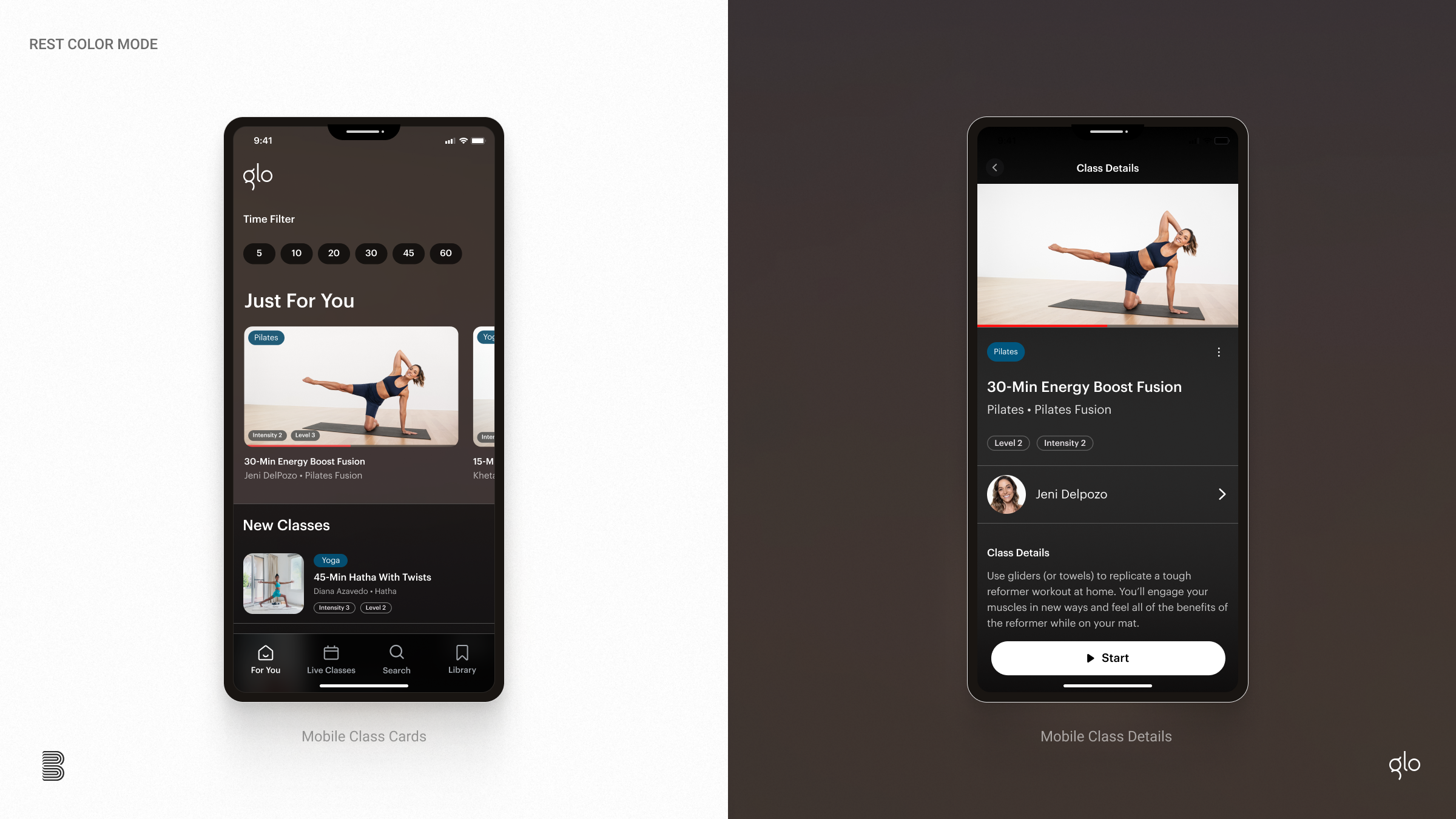
Flexible Color Profiles
Embracing Glo’s existing color modes, we incorporated three distinct color themes into the class card system, allowing the entire experience to shift based upon time of day or preference.
Live Classes
In 2021, using the new class card system, Glo successfully launched the full live classes feature. The success of this innovation was, in large part, a direct result of our earlier class card system overhaul. By leveraging the enhanced class card framework, we seamlessly introduced live cards that focused on the instructor, time, and group attendance—elements crucial for delivering an authentic live class experience.


Impact
Glo's live class feature, embraced by users with enthusiasm, showcased the organization's ability to respond effectively to user needs, driving innovation and enhancing its position as a frontrunner in online yoga and meditation. My contributions to Glo's user experience resulted in tangible benefits: a 15% decrease in subscriber churn, a 35% increase in class engagement, and a 40% reduction in class search time.
– Unified the design across devices
– Improved time to find classes as well as class starts
– Integrated real-time notifications
– Reduced customer complaints and negative reviews
– Reduced subscription churn